design
printing
printing
design
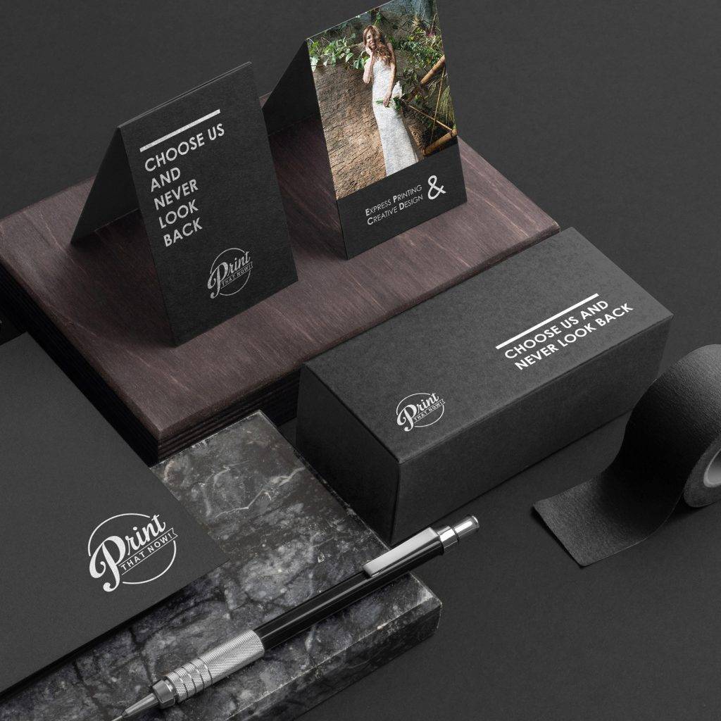
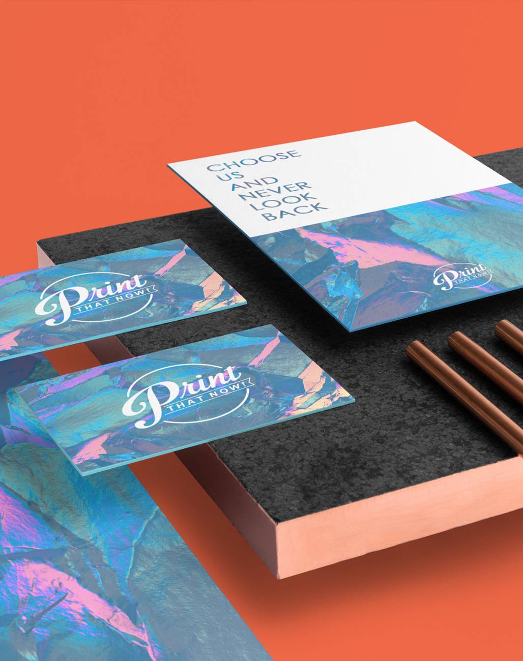
Business Stationery
Start Shopping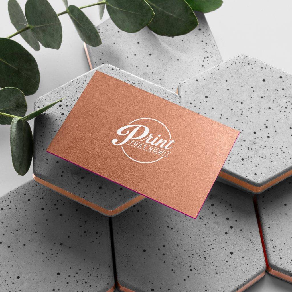
Cards
Start Shopping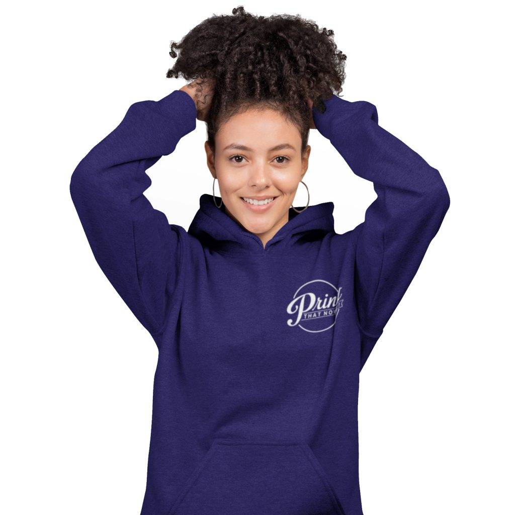
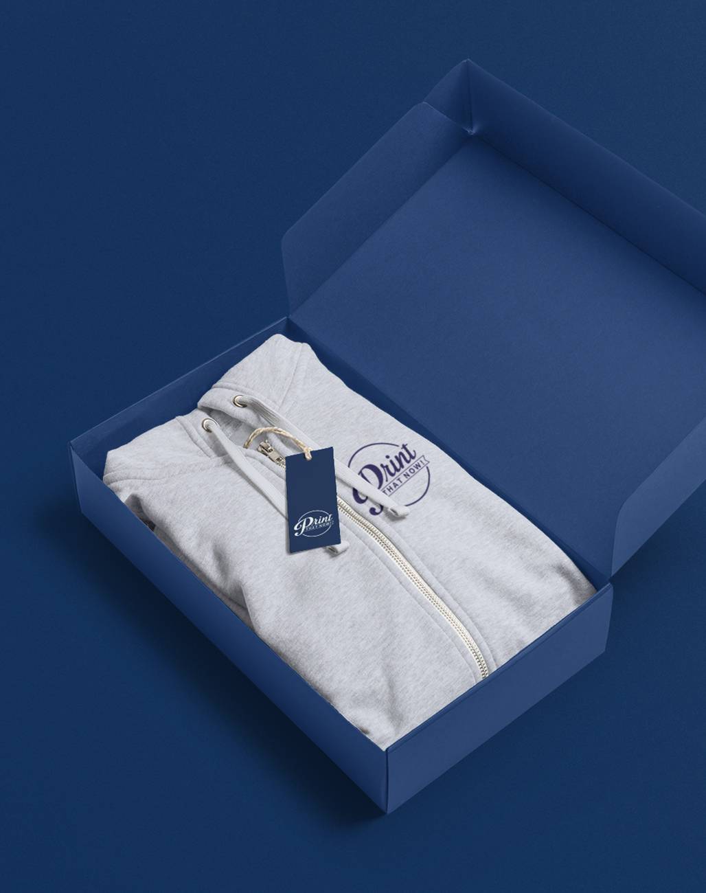
Clothing
Start Shopping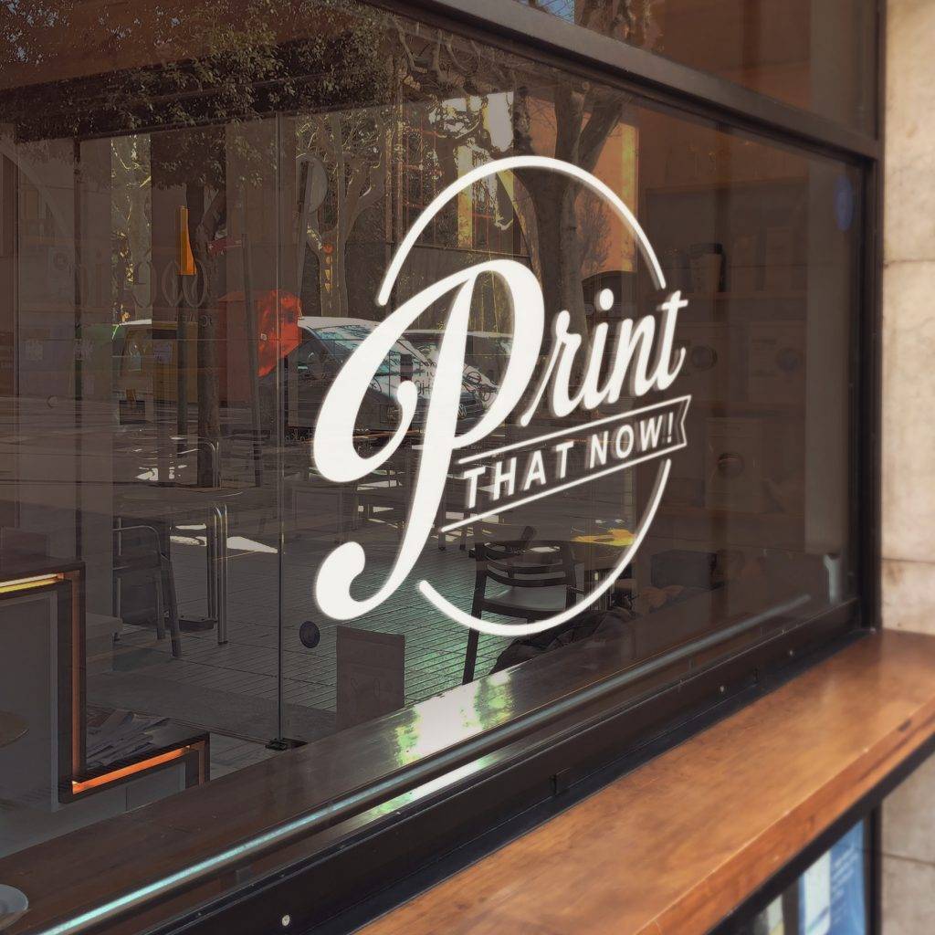
Graphic Displays
Start Shopping
Our professional printing services deliver premium prints for all businesses, within budget no matter how large or complex the order.
Singapore’s premier printing services since 2014, we know how important every detail is on every image prints. With a keen eye for each droplet of ink, we’ve been growing in strength and reputation for more than half a decade – we have an extensive range of printing products, and the technological printing knowhow needed to impress every time.
Quality, price and speed are all important factors, but it’s the printing passion you get from Print That Now! that makes us the best. We want your product to have that ‘wow’ factor every bit as much as you, so you can trust us to get it right!
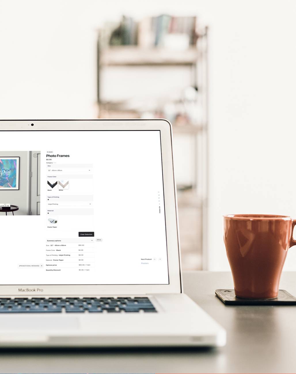
With a smooth printing ordering system that minimises problems, and experienced printing staff always willing to take your call, Print That Now! are here for every printing services request. Why not start the printing process right away?
If there is no response within 6 working hours, please reach out to us.