Flyers / Brochures are great promotional materials to pass around to attract potential customers. However, with the plethora of options available, you need to create a flyer or brochure that stands out and captures attention. Even with the rise of digital marketing, it’s essential to ensure you have high-quality physical promotional materials at your disposal. This blog post will explore tips and tricks you can use to create eye-catching flyers and brochures that will make your brand stand out.
Create a clear message
A flyer or brochure’s primary objective is to communicate a clear message to the target audience. Therefore, it’s important to have a clear idea of the message you want to convey before starting the design process. That way, you can ensure that your message is prominent and stands out to your target audience.
Use striking visuals
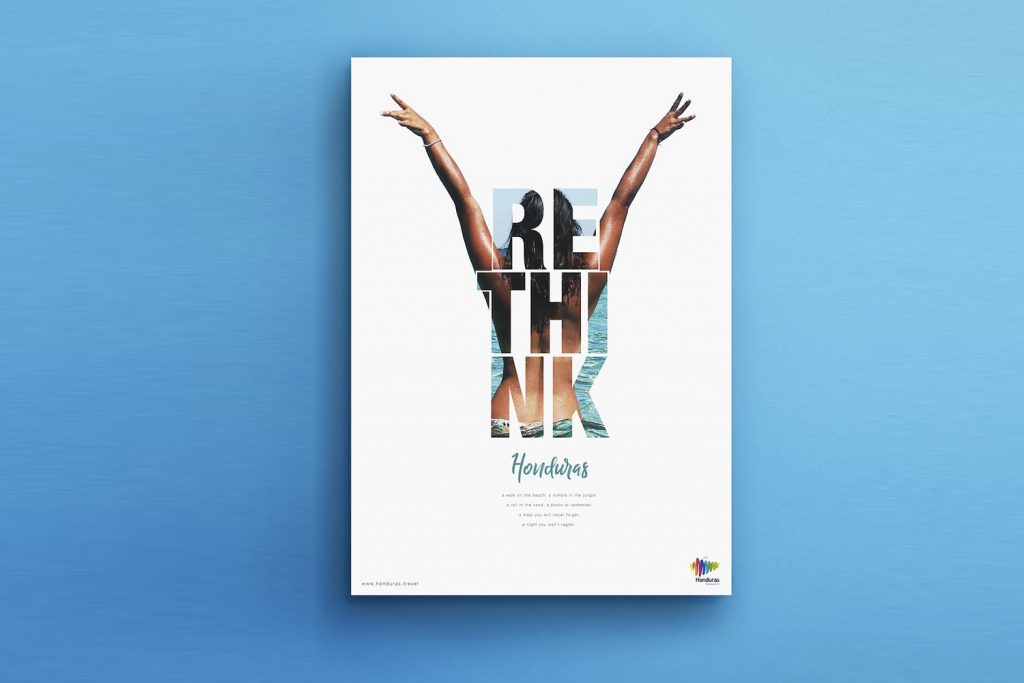
The best way to capture attention is by using striking visuals. Thus, it’s essential to include high-quality images and eye-catching graphics that depict the message you want to convey. Ensure your visuals are relevant to your brand, message, and target audience. In addition, avoid cluttering your flyer or brochure with too many visuals that may distract your target audience from your primary message.
Use colors strategically
Color is one of the most powerful ways to evoke emotions and attract attention. Therefore, it’s important to choose colors that complement your brand and evoke the emotions you want your target audience to feel. Ensure your color choices are consistent across all promotional materials, including flyers and brochures.
Use attention-grabbing headlines
When crafting a headline, ensure it grabs your target audience’s attention and highlights your message’s most critical point. Your headline should be clear, concise, and well-written, with an appropriate font size to attract attention.
Choose the right fonts
Fonts play an essential role in how your brand is perceived. Strive to choose fonts that are easy to read and reinforce your brand. Avoid using too many fonts as they may appear cluttered. Instead, stick to two or three fonts that complement each other and your brand message.
Creating an eye-catching flyer or brochure takes time, effort, and creativity. Ensure you follow our tips and tricks to create promotional materials that will stand out and capture your target audience’s attention. Remember to create a clear message, use striking visuals, use colors strategically, use attention-grabbing headlines, and choose the right fonts. By following these guidelines, you’ll create promotional materials that will boost your brand’s visibility and attract more customers.


