Owing to the fact that your name cards will be shared for months and years getting the font right before the Singapore printing company starts the printing process is most important. Font represents the accents, symbols, letters and numbers represented by a specific style. Selecting the right font allows you to create easy-to-read name cards that draw attention unto themselves.
Fonts/typefaces choice
Typefaces are critical to select, which are generally the “style family” or the real styles of specific letters; fonts are integral variations in typefaces. Fonts in typefaces are the weight and size of the letters as well as general, bold or italic special styling. While typeface and font have been widely used to mean the same there are differences between the two.
Even so, the font and typeface you request printing companies in Singapore to go with are important if you are to get your branding right. Selecting your font right will help you deliver your card content well and professionally. Most importantly, select the font you are comfortable with in respect with your industry, type of brand or product you provide.
All printing services for name cards will tell you that how you design and print cards matters. It is more important when adding the right small prints on your card. You must be careful to select them properly.
Even so, pay attention to a number of things.
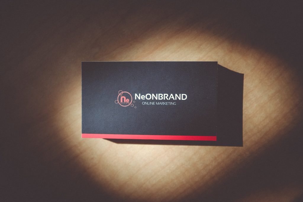
Font anyone can read easily
At times complicating a name card with weird font and typeface could work against you. It should always be very easy for the eyes and attractive to look at. Easy to read ones include Helvetica, Times New Roman or even Arial among others, essentially sans-serifs. They are used heavily on the name of the company or name of the individual.
Serif styles such as Times New Roman also come in handy for contact information. Even so, in case you have diverse promotional marketing items apart from name cards ensure the text style is the same throughout.
Do not jumble font types
Ensure name cards are printed by the printing services in Singapore at least with just 1-2 font type only. Mixing lots of font types could make the card muddled up and cheesy. Even so, you can ensure your name/company title is stressed by another font style for a total of two fonts only. That way, your name card will look neat and uniformly designed.
Stand out fonts
It is definitely not a crime to add a power font if you so desire, especially if you want the name of your business to stick out. These include Elephant, Rocket, Forte, Clarendon and Impact, among tens of others.
As your printing service Singapore professionals will tell you, avoiding too small font sizes is important. So many people who will come into contact with your card have faulty visions. For instance, always avoid font sizes of below seven or over-enlarging your name or that of your company on the card. The entire name card design must be proportional.